Go Bold: How to Use Bright Colours This Season
Neutral colour schemes are popular amongst home owners and interior designers for their longevity. They never go out of style and it’s easy to update a room each year when your canvas is made up of versatile whites or nudes.
Sometimes, though, we feel like escaping the ordinary and being adventurous with pops of bright colours and exciting accessories. Take the plunge with tasteful explorations of colour with our guide to going bold this season.
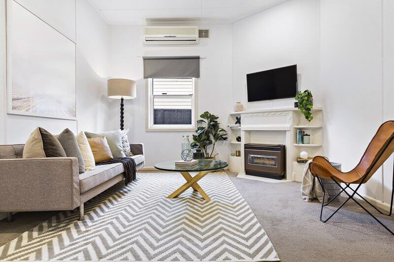
Get Inspired by Scandinavian Twists

The Scandinavian home interior style is something that contemporary homes are embracing. For a crisp, white-washed room that’s embellished with pine furniture and snowy soft furnishings, Scandinavian design is defined by monochrome colour schemes and clean, straight lines.
From time-to-time, this style gets shaken up with bright colours and bold patterns to add sharp contrast against an otherwise white backdrop.
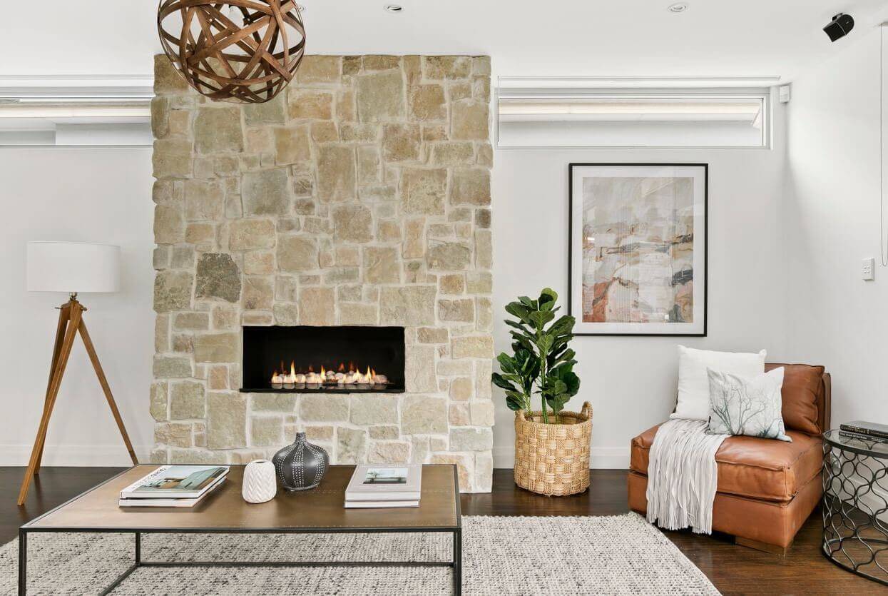
To get this look right, we recommend starting with pot plants for elements of deep, natural greens throughout the home. Nature always looks good, and real plants look amazing paired with a grey wall. Complement the nature tones with botanical art prints and pine wall shelves to maintain that distinctive Scandinavian style.
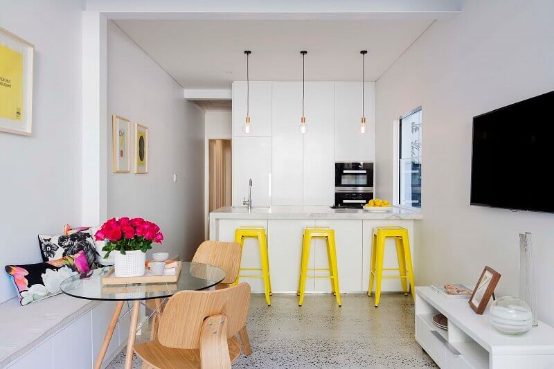
This season, monochrome and pastel decor gets an update with green and yellow accents. Inject these daring colours using cushions, wall art, or invest in one brightly-coloured armchair that will add some artistic flair and individualism to a room.
Hot & Spicy Tones

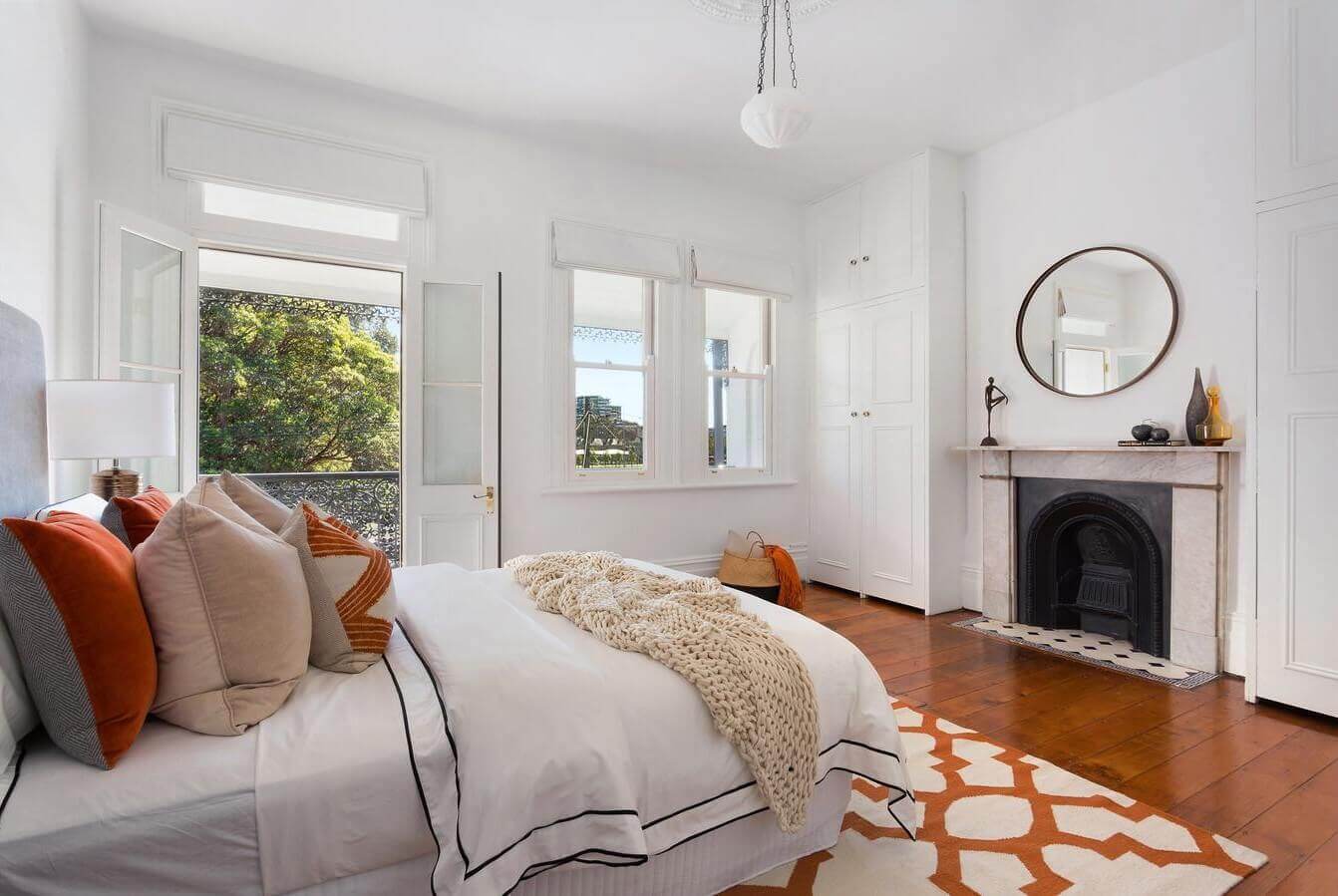
If you want to decorate a room with bright colours and modern decor, but clashing shades fill you with dread, ease yourself in with hot colours that add an interesting depth to bedrooms and living rooms.
Gold, burgundy and orange add a touch of spice to a neutral room, so play around with patterned cushions and warm-coloured armchairs. Opt for an off-white or beige sofa so you can easily update the room when you feel like a refresh.
A bold rug and orange blooms can turn up the heat and add finishing touches to a room that’s going for gold. With soft furnishings and abstract artwork, transform any space into a welcoming and comfortable haven.
The Bolder, the Better

The catwalk doesn’t shy away from splashes of colour and unapologetically bold designs, so why should interior design? Take the opportunity this season to finally cut off pastel colours and welcome more adventurous, almost cartoon-like shades into your home.
Again, pair a white or grey background with pops of bright colours – and don’t be afraid of clashing. A green velvet sofa can work well with deep red armchairs and a scattering of coloured cushions. Almost anything goes, as long as the design feels inviting, rather than uncomfortable.
Interior designers are taking inspiration from Morocco, pulling a room together with deep blue, mustard and hot pink hues. Go all out by making an eccentric sofa the main event of the room, or take baby steps with bright, eye-catching art and oversized chairs.
The Shades of the Season

Colour trends come and go and we can’t guarantee that you won’t look back one day on your current favourite colour scheme and wonder what you were thinking.
Staying on top of colour trends and incorporating them properly into the home is key to creating a harmonious environment. Harness the power of colour for balance, and switch up your interior design regularly to maintain that loving relationship with your property.
The trends that we see on the runway often translate to interior design. 2018’s schemes are versatile, so you can select the style best suited to your personality and property features.
Essential colours take us back to basics this year, keeping tones simple and muted. With an appreciation for natural and recycled materials, combine shades like grey, terracotta and sand for a somewhat humble and inviting atmosphere.
Feel like taking a trip from the norm? Escape from reality when you set foot in your own door, by opting for tropical prints and adventurous colours. Shade clashes can really brighten up a space, so play around with mustard yellow, shades of pink and even 70’s-inspired blue tones.
Bright colours can truly transform a room and keep the excitement alive within your home. For more inspiration, browse the ‘before & after’ images of spaces we’ve given some life through pops of colour and clever design.


