


Colour is such an integral part of our everyday environment and influences the way we feel and how we relate to our surroundings. For property stylists and interior designers, the successful application of colour into the home is key to creating a harmonious environment. At EVOLVE, we consider new colour trends, and embrace colour when curating new property styling and interior design spaces for our Sydney based clients.
DRIVING CHANGES OF UPCOMING COLOUR TRENDS
The design world is for the most part aligned with the fashion world when it comes to upcoming colour trends. The two major weeks of Fashion occur twice a year, in the four leading fashion capitals of the world: New York, Milan, London and Paris.
New colour trends that are seen on the runway shows during fashion week, usually set the tone for colours that are embraced by interior design influencers at major design events: Salone del Mobile Milano and Maison & Object which follow.
After considering the major international fashion and design events in the earlier months of this year, some re-occurring colour trends have emerged. So, what can we expect to see more in interior decorating furnishings, accessories and paint colours for the rest of this year? Here are a few of our predictions.
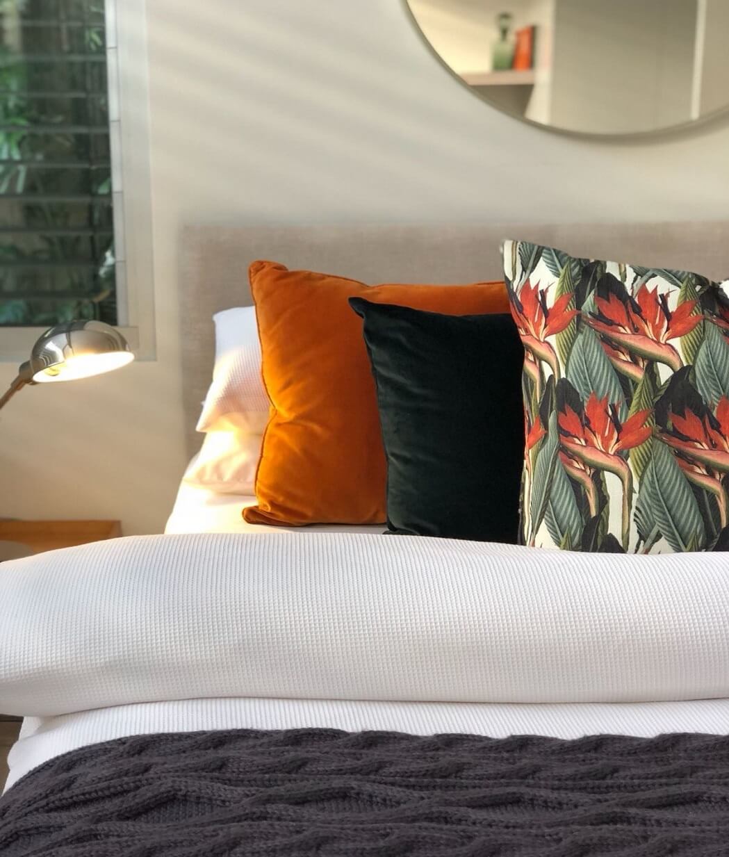
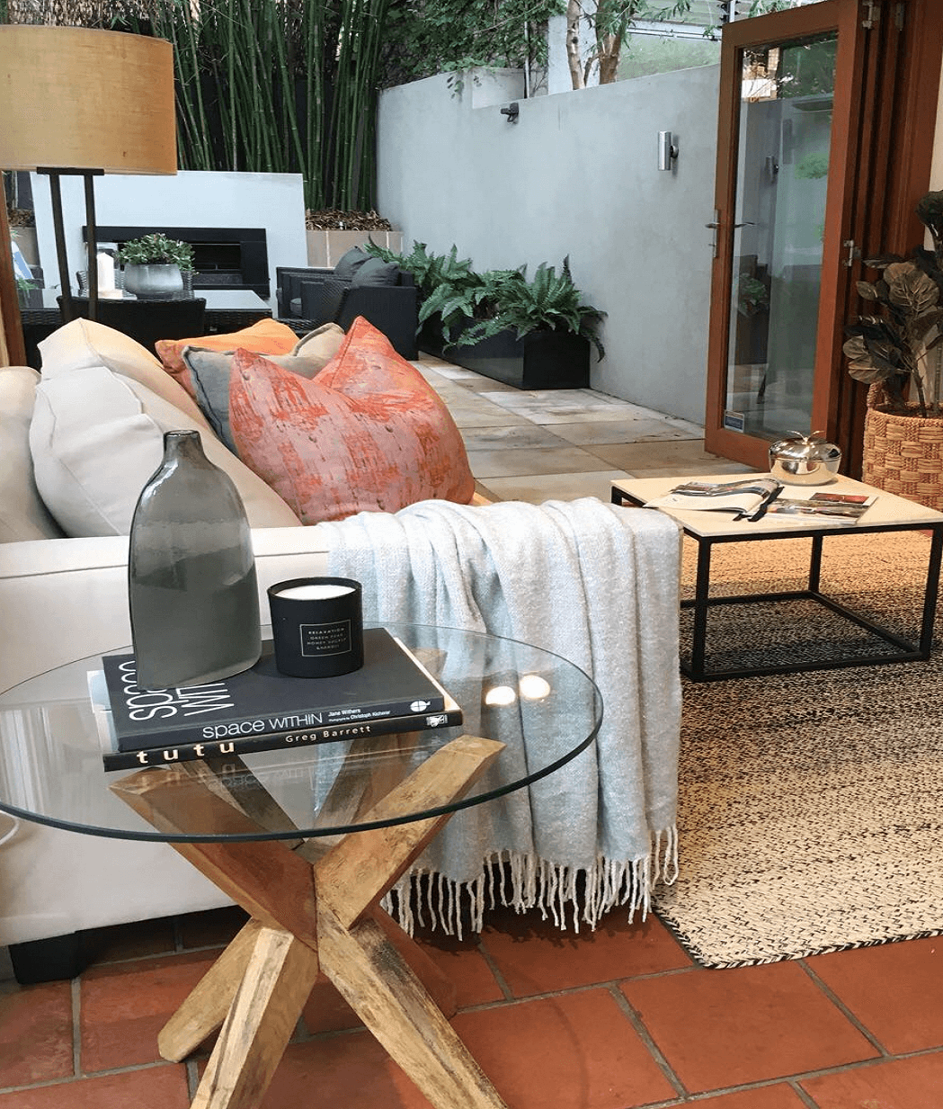
INSPIRED BY NATURE – RUST, TERRACOTTA, SIENNA AND GREYED GREENS
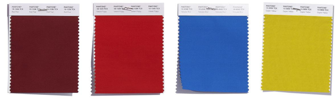
The Pantone and Dulux colour trend palettes both identified with these tones including robust dirty reds, terracotta, toasty browns, olive hues and greyed greens.
Incorporating these earthy tones into your home interior is simple, as these colours are versatile and work with almost every neutral.
These colours work beautifully with creams and varying shades of white, timber, natural elements and indoor plants + Greenery. For a more dramatic, sophisticated look, team terracotta or burnt orange with black or emerald. For a clean natural look, team orange and greyed green accessories of varying heights and textural finishes together in small clusters.
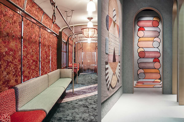
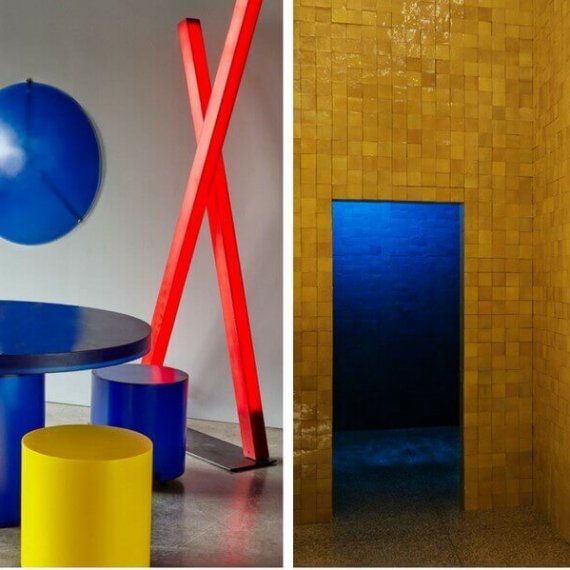
INSPIRED BY PIET MONDRIAN – PRIMARY BLUE, RED AND YELLOW
A world away from the autumnal hues discussed previously, both design events had exhibitors working with bold primary colours, as displayed by Prime Collection’s geometric resin furniture and Hermes sophisticated tile heavy installation which wowed visitors. These three hues also feature in the top 12 fashion Pantone hit list for Autumn/Winter 2018.
From an interior design perspective, the use of primary colours, particularly in heavy doses, are usually reserved for children’s playgrounds, childcare centres and other environments which require active stimulation. However, when used correctly, these colours can have a great impact on interior design and property styling spaces, either as stand alone colours or as a trio.
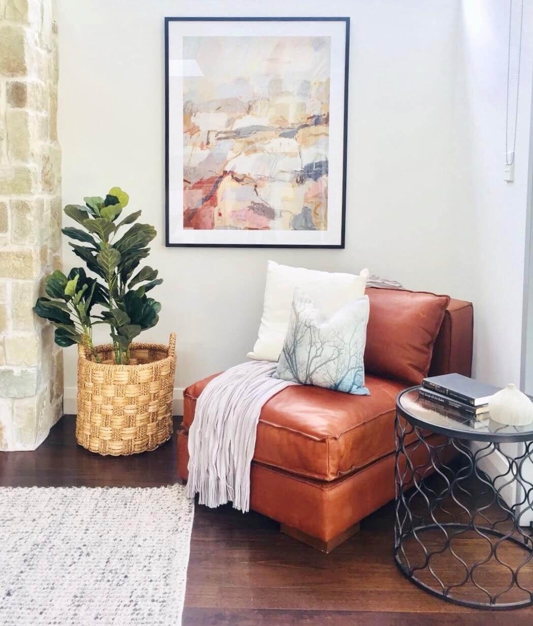
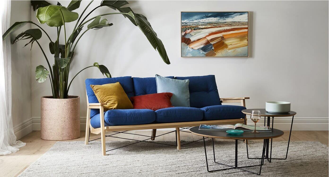
GlobeWest has successfully combined all three colours here – with a strong cobalt blue lounge teamed with accents of muted yellow and red cushions, and grounded by a neutral grey rug. It is a strong look that works particularly well with the colours echoed on the wall behind in the abstract canvas.
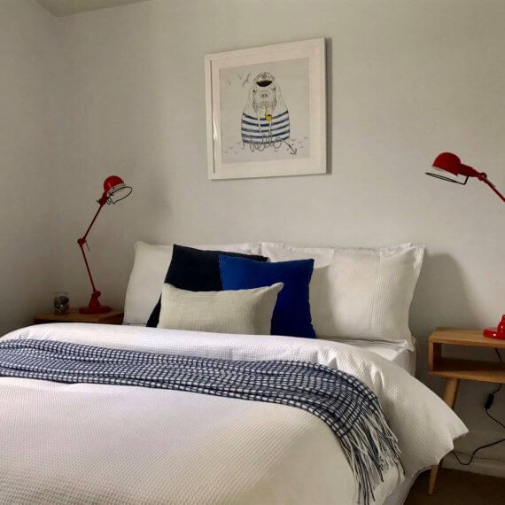
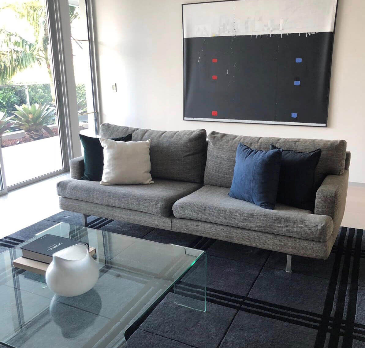
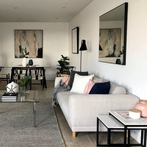
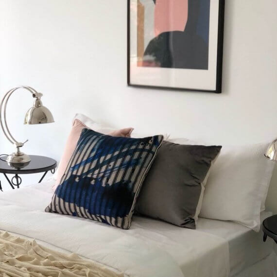
The images below have been taken from some of our recent property styling installs in Sydney, which also hints to this new trend. With little pops of primary colours, these highlights of blue and red keep the space vibrant and interesting without boldly pushing colour.
INSPIRED BY MOLLY RINGWALD – PINK
 Lastly, we cannot ignore the enduring run that pink has had, from blush to burgundy and tinges of pink mixed with violet both design meets indulged in PINK. Various shades of this hue work great with the two above discussed forecast colour trends. Team dusty desert pinks with greyed greens and or oranges to curate a pretty girls bedroom or a serene living space.
Or, if you prefer a bolder look, don’t be afraid to use pink with red – totally against what you were told growing up, these two colours work great together. As does primary blue with pink.
So embrace colour this winter, be it a serene desert inspired living space in greens and oranges or a vibrant kitchen display highlighting some primary hues. Have a bit of fun and keep your home looking fresh and interesting by rescuing some of those bowls and ceramic vases in the back cupboard to curate a new pocket of interest in the home.
As Juan Montoya once said “A room should never allow the eye to settle in one place. It should smile at you and create fantasy.”
Author: Mel Smith – Stylist at Evolve
